- Show, don't tell
- Try shorter paragraphs
- Choose a color scheme that fits your branding strategy
- Reinforce actions with familiarity
- Simplify the navigation
- Optimize your design for mobile devices
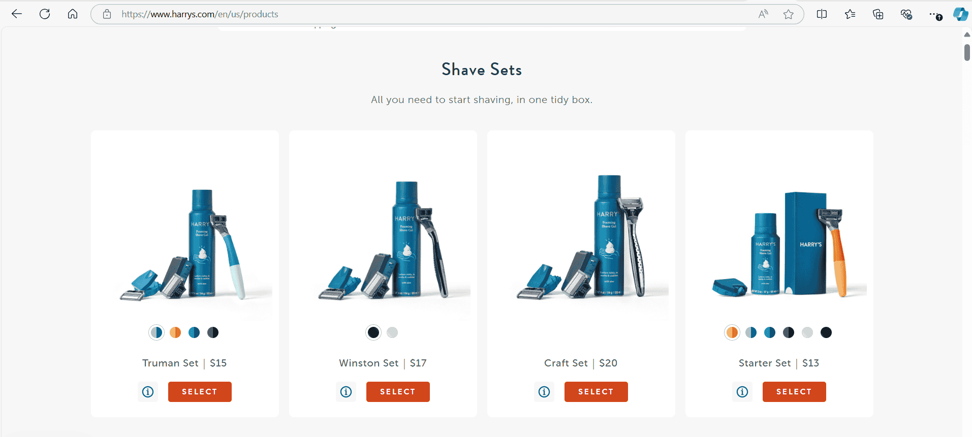
Let visuals speak louder than text by displaying information clearly. Harry’s website uses imagery to communicate their brand and products effectively without overwhelming the user with text.
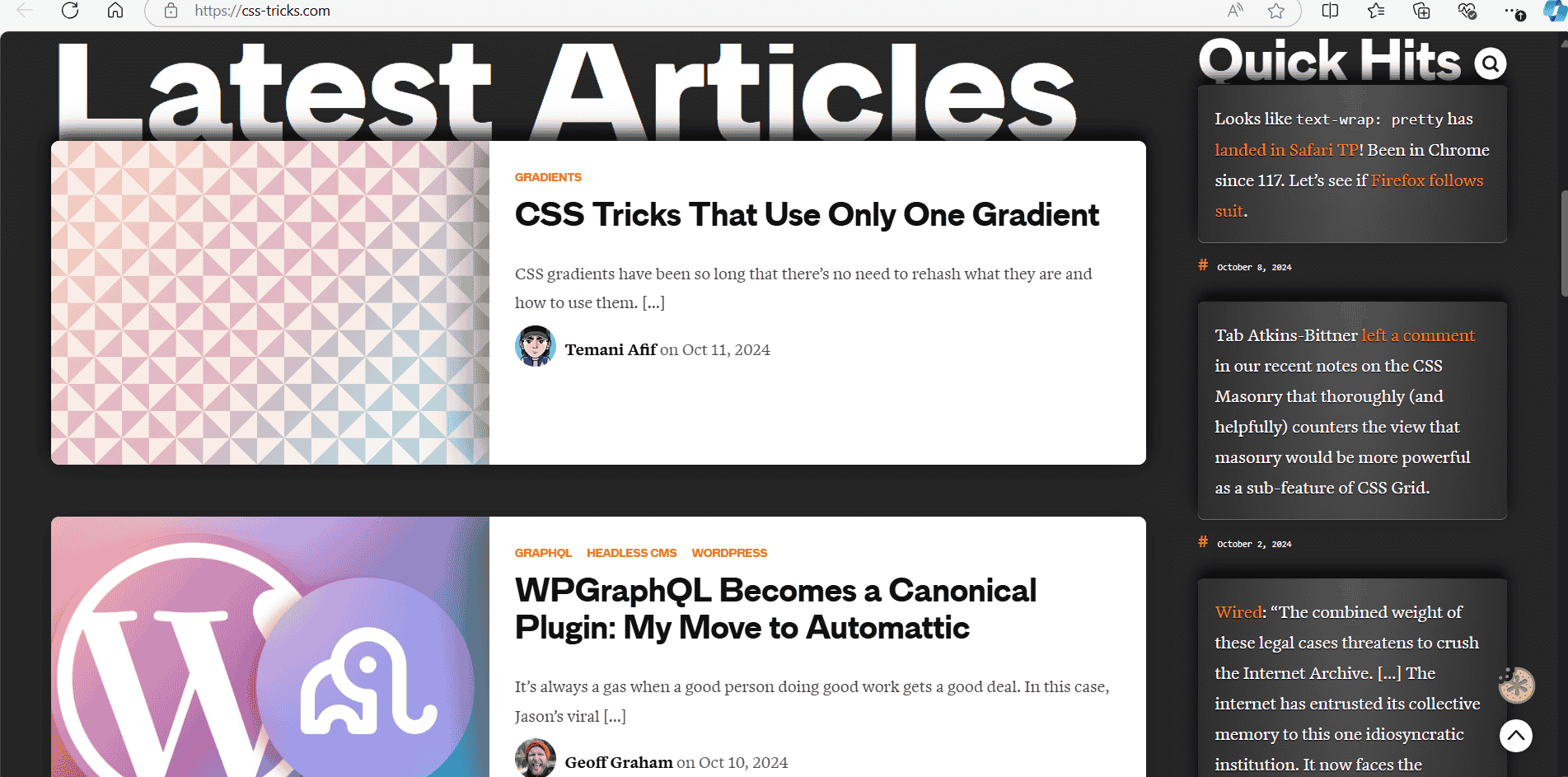
Breaking up long blocks of text improves readability. CSS Helper’s site demonstrates how concise content engages users more effectively by keeping the messaging simple and clear.
Your website’s color palette should align with your brand. Stripe’s minimalist blue tones communicate trust and professionalism, reinforcing its financial services.

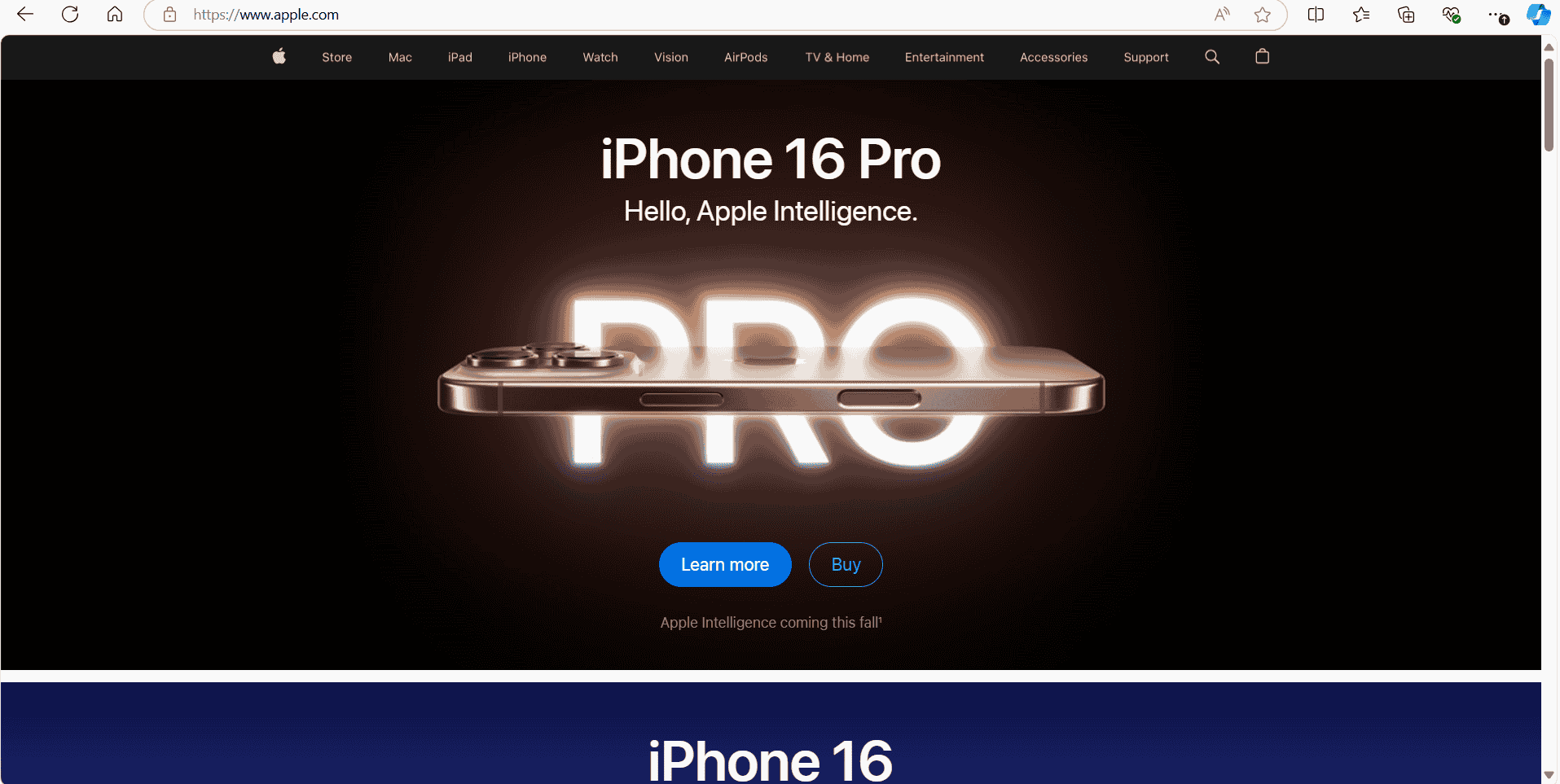
Design with familiar patterns that users recognize. Apple’s site uses Similar css code on all of there pages so the the user knows where everthing is.
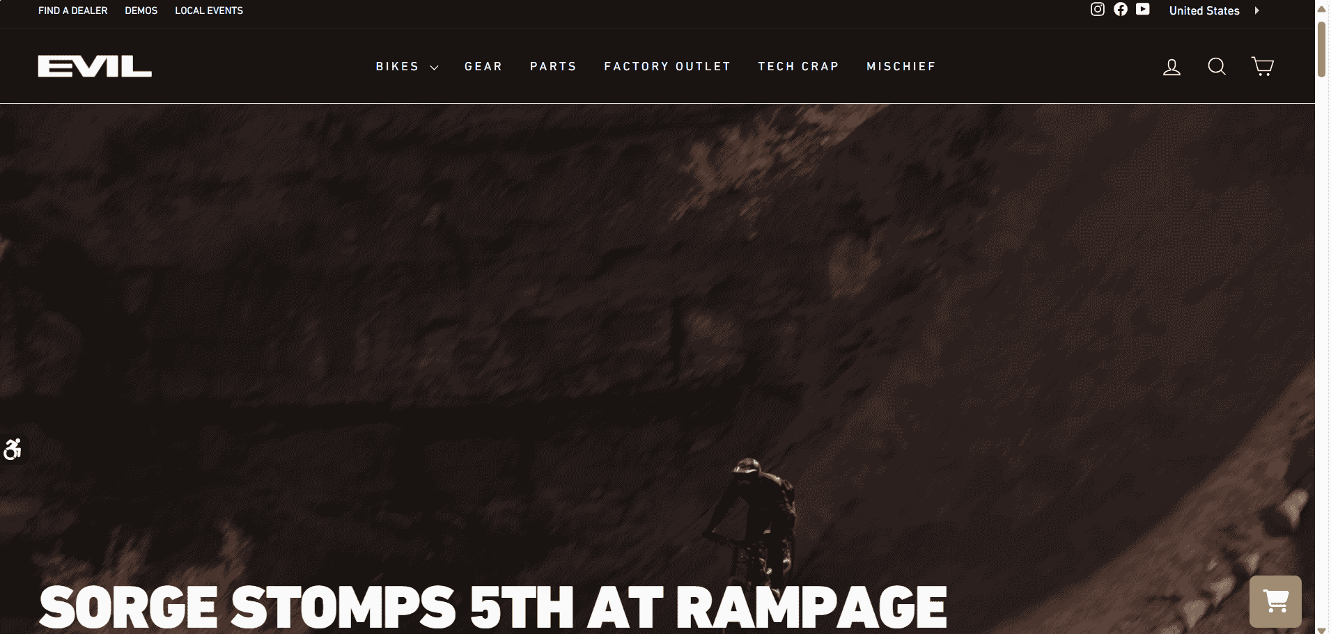
Clear, straightforward navigation helps users find information quickly. Evil Bikes’ website has a clean and simple menu layout, guiding users to their desired sections efficiently.
With more users accessing sites on mobile, it's crucial to ensure your design is responsive. Yahoo’s website shows how to effectively adapt layouts for mobile screens.
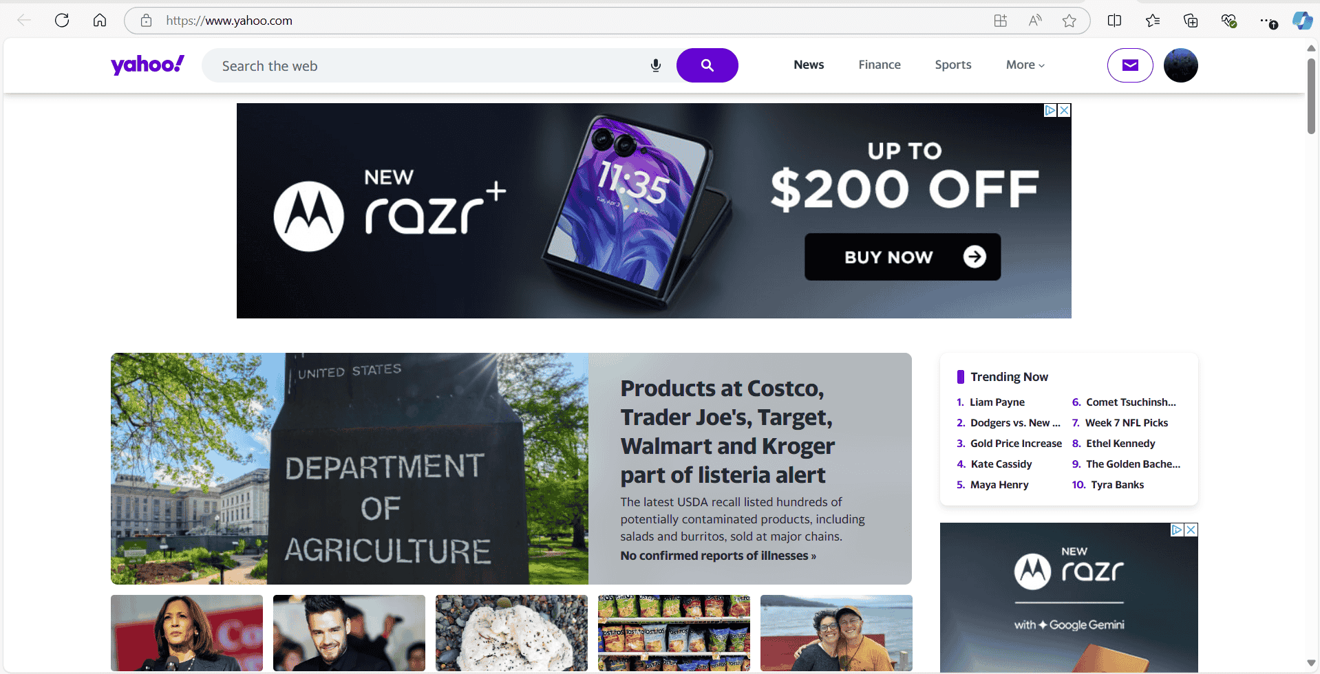
Yahoos site on a Iphone