What I like about the page:
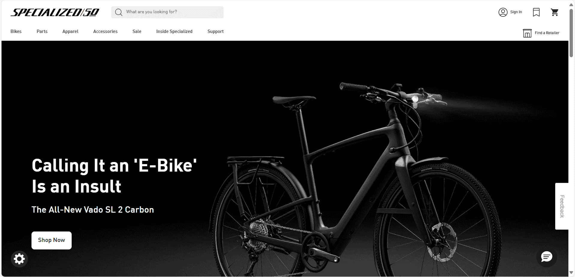
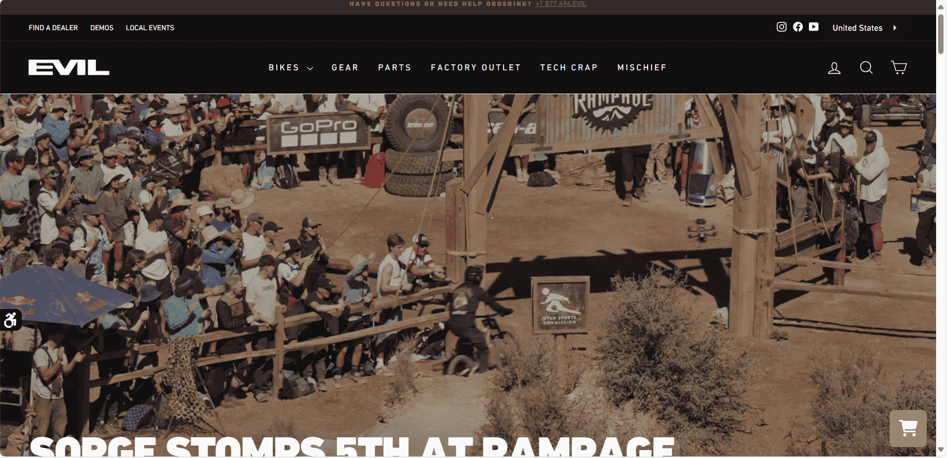
The design uses high-quality imagery and dark color schemes, which align with the brand's “edgy” and premium feel. The top navigation is minimal and straightforward, making it easy to find bikes and related content without overwhelming users. Consistent use of typography, logos, and design elements strengthens brand recognition and makes the website feel cohesive. The use of high-quality photography for bikes and components shows off products in a professional way. Visuals are important for high-end products like bikes.
What I don't like about the page:
The CTAs ("shop now," "learn more") could be more prominent and consistent across the site. Some buttons blend too much into the design, making it harder for users to take action. The initial view (above the fold) is dominated by large images, which, while visually impactful, may delay access to important information like pricing or product details. The user has to scroll down to see key content. While the imagery is impressive, it may overwhelm users who are looking for more concise information. Some pages feel too image-heavy, which could slow down the experience for users with slower connections.